When I took the reins of Windmill’s website redesign, we faced a common but daunting problem: a disjointed digital experience. Donors had to go through many steps to make a donation, partners weren’t sure how to connect with us, and our brand voice felt inconsistent across 120+ pages of tangled content (not even counting blog articles). The mission? Build a digital home worthy of Windmill’s vision—one that could speak equally well to a philanthropist in Montreal, a newcomer to Canada looking to break into the workforce, and a corporate partner in Toronto.
The journey
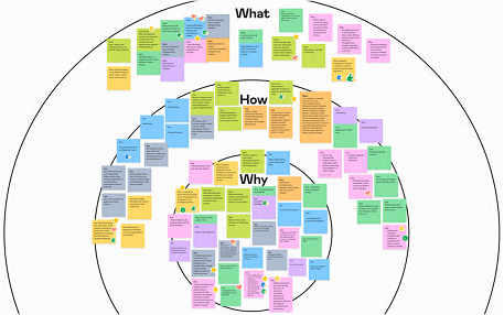
1. Laying the foundation (aka the art of stakeholder symphony)
Picture this: Fundraising wanted more donor conversions. Client Success needed a better client journey. Programs demanded clearer visibility. Marketing insisted on brand consistency. My role? Conducting this symphony of needs into a cohesive blueprint.
As the primary liaison between leadership, internal teams, and our external development agency, I facilitated clear communication and timely decisions. Through workshops (and arguably never enough sticky notes), we transformed competing demands into a logical sitemap and intuitive user journeys.
Key learning: Aligning leadership taught me the art of managing expectations—balancing idealism with deadlines to launch on time without compromising priorities.
2. The great content purge
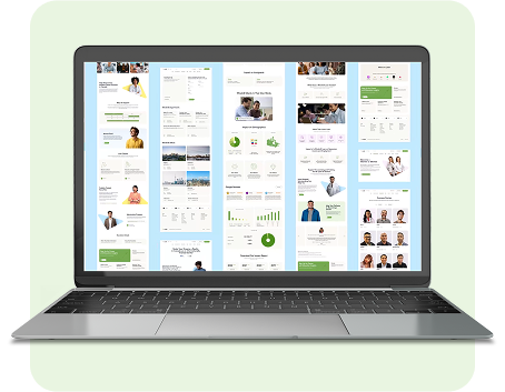
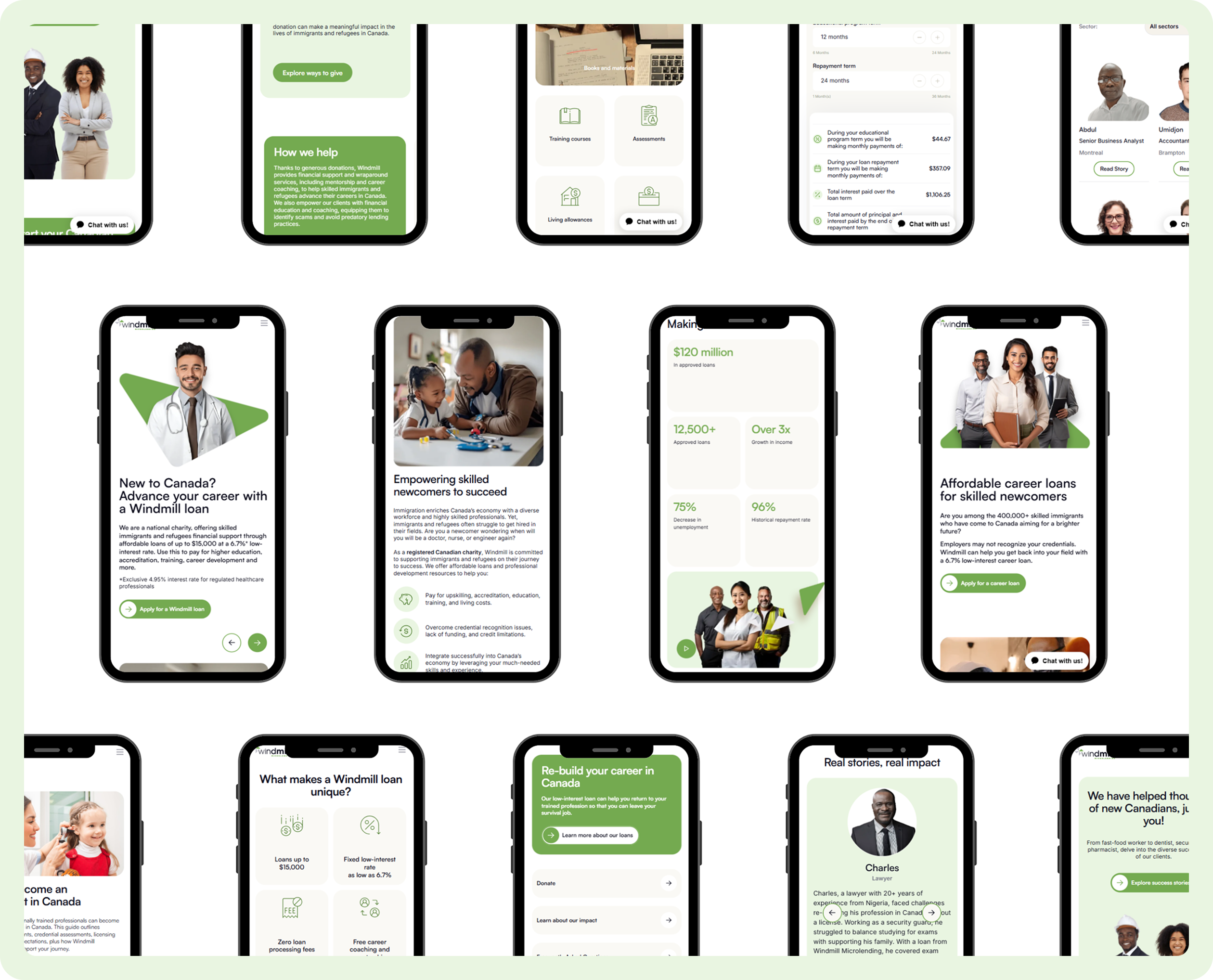
Our old site hoarded content like a cluttered attic—duplicate pages, outdated reports, and donor materials hidden in obscure corners. Armed with analytics and user feedback, I led a content audit that felt equal parts detective work and spring cleaning. We axed redundancies, elevated critical information, and crafted tailored pathways for each audience. The result? A streamlined 60-page website where users could actually find what they needed.
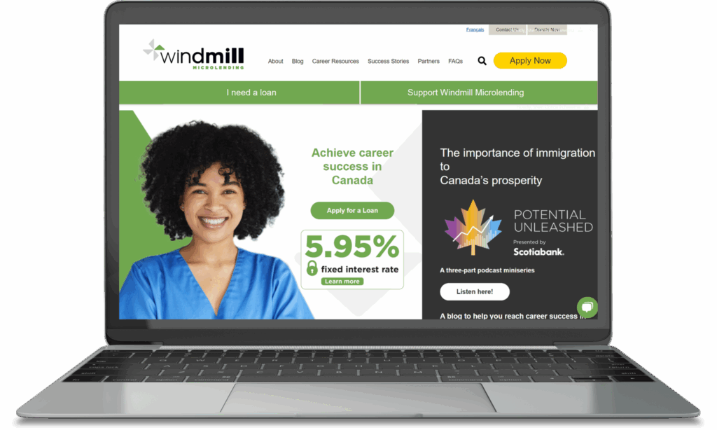
3. Design that worked (and looked good doing it)
I managed the website’s visual and UX design, ensuring every pixel reflected Windmill’s brand identity. Collaborating closely with the agency, I guided wireframing, prototyping, and creative direction—especially for high-impact landing pages and user flows. The goal? A site that wasn’t just functional, but felt unmistakably like Windmill.
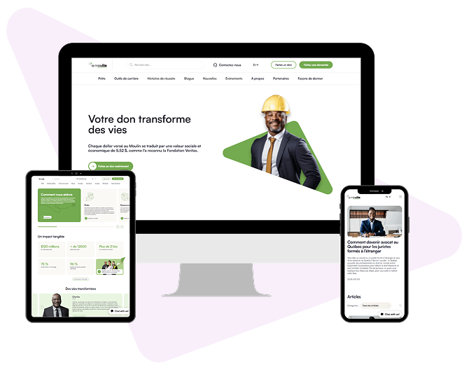
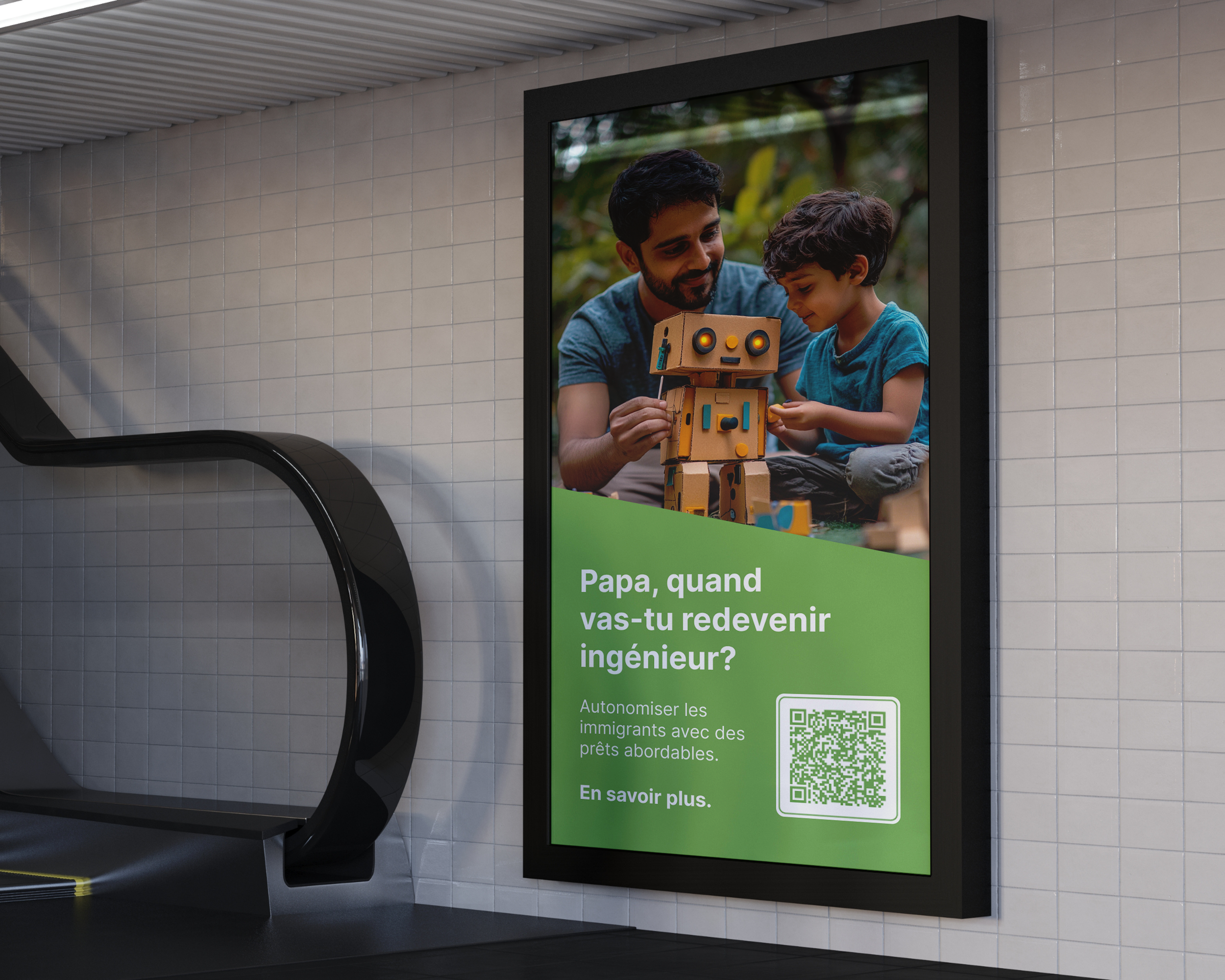
4. The art of bilingual branding
With the English site launched, the real fun began: adapting everything into French. More than translation, this was reinventing our voice for a language that naturally uses 20% more words—preserving Windmill’s tone while ensuring every cultural nuance landed perfectly. The result? Two equally authentic experiences, live and in perfect harmony.
The payoff
The new site didn’t just look better (though it absolutely did). It delivered:
• 64% increase in engagement rate • 267% growth in 90% page scrolls (from users reading near-complete pages) • Rave reviews from leadership about the intuitive navigation and clean design
But the real win? Building a living platform that grows with Windmill’s mission. Today, I still optimize user journeys, expand content, and analyze data—because like social impact, an exceptional website is never “done.”